Bart Support
Widget styles
Learn more about ‘Widget Styles‘ on the ‘Intranet‘
App style
Steps
- Navigate to a section on the intranet where you would like to add or have already added a ‘Widget‘
- Select the ‘Design‘ dropdown tab
- Under ‘Style‘ select the ‘App‘ option
- Choose the numbers of ‘Items to display‘
- Add the ‘Display date‘
- If you would like, select the checkbox for ‘Custom date format‘
- If you would like, select the ‘Show more‘ link
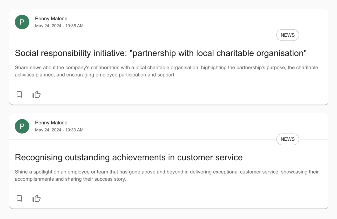
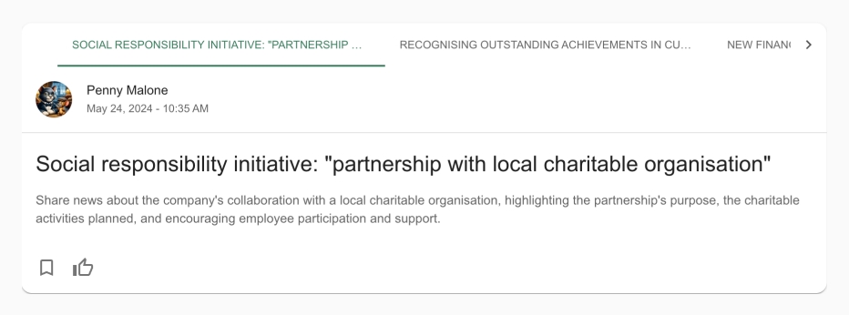
Example
Carousel style
Steps
- Navigate to a section on the intranet where you would like to add or have already added a ‘Widget‘
- Select the ‘Design‘ dropdown tab
- Under ‘Style‘ select the ‘Carousel‘ option
- Add the ‘Style‘ of ‘Single image‘ or ‘Multi image‘
- If you would like, select the checkbox for ‘Link image to content‘
- Input the number of ‘Items to display‘
- Select the ‘Image style‘ and choose the aspect ratio
- If you would like, select the checkbox for ‘Use Manual Crop‘
- Add the ‘Display date‘
- If you would like, select the checkbox for ‘Custom date format‘
- If you would like, select the checkbox for ‘Show More link‘
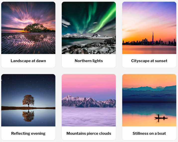
Single image example

Multi image example

Gallery style
Steps
- Navigate to a section on the intranet where you would like to add or have already added a ‘Widget‘
- Ensure that you have the ‘Gallery‘ widget
- Select the ‘Design‘ dropdown tab
- Under ‘Style‘ select between ‘Slideshow‘ and ‘Grid‘
- When ‘Slideshow‘ is selected input the ‘Aspect ratio‘
- When ‘Grid‘ is selected, input the number of ‘Columns‘
- Select ‘Save‘
Example

Grid style
Steps
- Navigate to a section on the intranet where you would like to add or have already added a ‘Widget‘
- Select the ‘Design‘ dropdown tab
- Under ‘Style‘ select the ‘Grid‘ option
- Select the number of ‘Items to display‘
- Select the number of ‘Items per row‘
- Select the number of ‘Items per row‘ for mobile
- If you would like, select the checkbox for ‘Link image to content‘
- If you would like, select the checkbox for ‘Show more link‘
Hero style
Steps
- Navigate to a section on the intranet where you would like to add or have already added a ‘Widget‘
- Select the ‘Design‘ dropdown tab
- Under ‘Style‘ select the ‘Hero‘ option
- Input the number of ‘Items to display‘
- If you would like, select the checkbox for ‘Link image to content‘
- If you would like, select the checkbox for ‘Display thumbnail images‘
- Input the ‘Display date‘
- If you would like, select the checkbox for ‘Custom date format‘
- If you would like, select the checkbox for ‘Show more link‘
Example

List style
Steps
- Navigate to a section on the intranet where you would like to add or have already added a ‘Widget‘
- Select the ‘Design‘ dropdown tab
- Under ‘Style‘ select the ‘List‘ option
- Under the second ‘Style‘ option Select one of the following options:
- ‘Ordered‘
- ‘Unordered‘
- ‘Useful links‘
- Select the number of ‘Items to display‘
- If you would like, select the checkbox for ‘Show more link‘
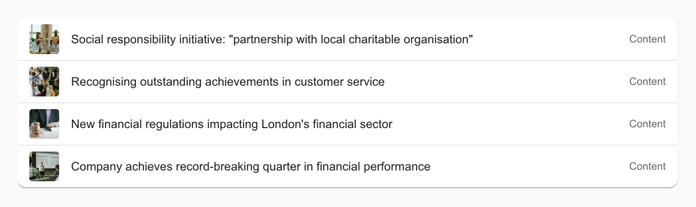
Example
Multi row card style
Steps
- Navigate to a section on the intranet where you would like to add or have already added a ‘Widget‘
- Select the ‘Design‘ dropdown tab
- Under ‘Style‘ select the ‘Multi-row card‘ option
- Input the number of ‘Items to display‘
- If you would like, select the checkbox for ‘Display image‘
- If this has been selected, input the ‘Image style‘
- If you would like, select the checkbox for ‘Use manual crop‘
- If you would like, select the checkbox for ‘Link image to content‘
- Input the ‘Display date‘
- If you would like, select the checkbox for ‘Custom date format‘
- If you would like, select the checkbox for ‘Show more link‘
- Select the relevant ‘Label‘ from the dropdown
- Select ‘Save‘
Example

Poll style
Steps
- Navigate to a section on the intranet where you would like to add or have already added a ‘Widget‘
- Select the ‘Design‘ dropdown tab
- Under ‘Style‘ select the ‘Poll‘ option
- Input the number of ‘Items to display‘
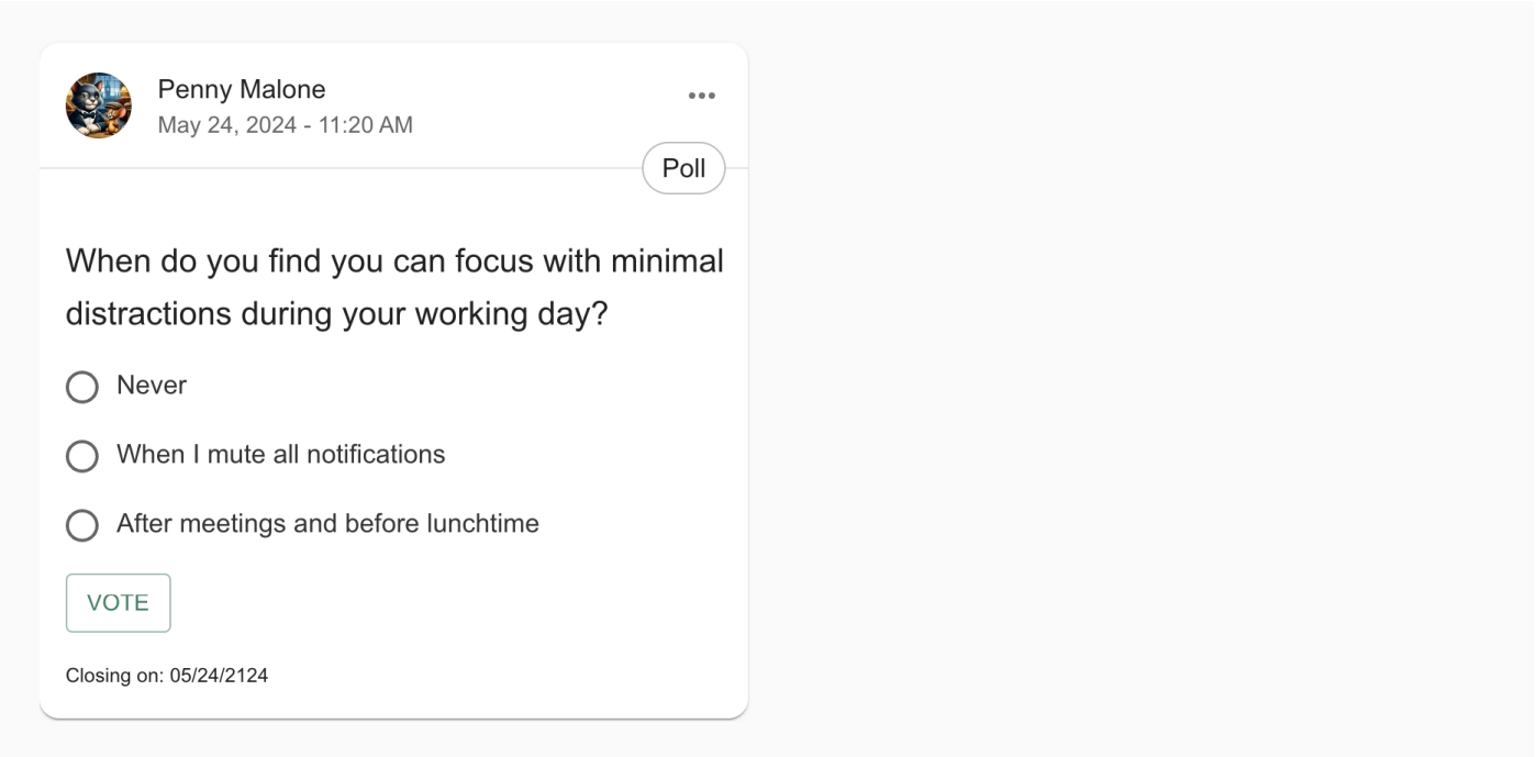
Example
Simple style
Steps
- Navigate to a section on the intranet where you would like to add or have already added a ‘Widget‘
- Select the ‘Design‘ dropdown tab
- Under ‘Style‘ select the ‘Simple‘ option
- Input the number of ‘Items to display‘
- If you would like, select the checkbox for ‘Display image‘
- If this has been selected, input the ‘Image style‘ and ‘Image direction‘
- If you would like, select the checkbox for ‘Use manual crop‘
- If you would like, select the checkbox for ‘Link image to content‘
- Input the ‘Display date‘
- If you would like, select the checkbox for ‘Custom date format‘
- If you would like, select the checkbox for ‘Show more link‘
- Select ‘Save‘
Example

Tabbed style
Steps
- Navigate to a section on the intranet where you would like to add or have already added a ‘Widget‘
- Select the ‘Design‘ dropdown tab
- Under ‘Style‘ select the ‘Tabbed‘ option
- Input the number of ‘Items to display‘
- Input the ‘Display date‘
- If you would like, select the checkbox for ‘Custom date format‘
- If you would like, select the checkbox for ‘Show more link‘
- Select ‘Save‘
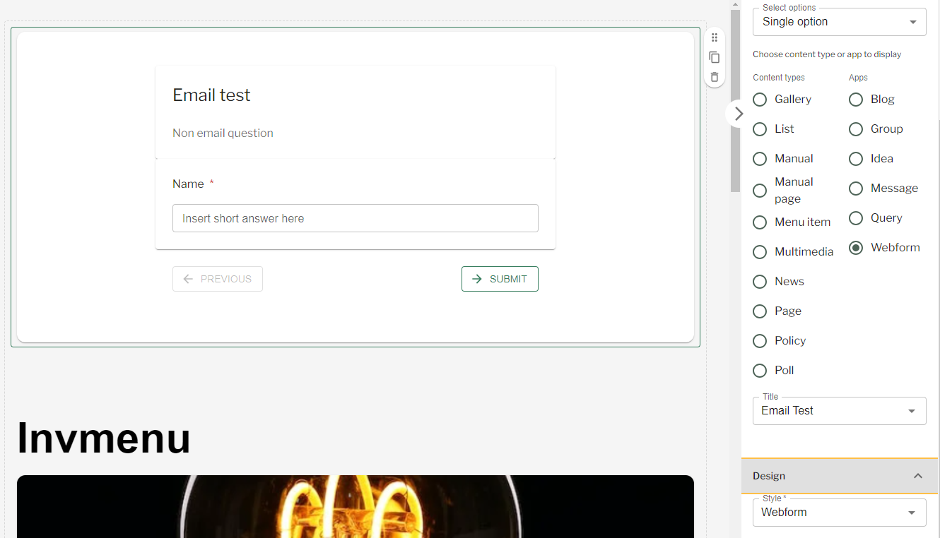
Webform style
Steps
- Navigate to a section on the intranet where you would like to add or have already added a ‘Widget‘
- In the ‘Display‘ dropdown ensure that ‘Single option‘ is selected
- Select ‘Webform‘
- Input the title of the specific ‘Webform‘ you want to display
- Select the ‘Design‘ dropdown tab
- Under ‘Style‘ ensure ‘Webform‘ is selected
- Select ‘Save‘
Widget Styles – Webforms
Demo video
Video timestamps:
- Multi row: 19.6s
- App Card: 1m 52s
- Carousel single image: 2m 30s
- Carousel multi image: 3m 10s
- Grid style: 4m 14s
- Webform style: 4m 50s
- List style: 5m 12s
- Simple style: 6m 26s
- Tabbed style: 7m 8s
- Hero style: 7m 28s
- Poll style: 8m 13s
Couldn't find what you're looking for?
We're here to help. Please raise a support request via our help desk and we'll get back to you asap
Page content