Webforms
What are Webforms?
Ask the big questions and gather vital insights from the people in your organisation. Webforms are a direct line of communication with your employees and colleagues, be that a single team or entire workforce.
There are several ways to style and configure questions in a webform. Design and test each component before publishing and monitoring the responses. You’ll be notified every time a form is submitted, building up research before making informed decisions that can drive change.
Relevant roles:
- Webmaster
- Publisher
- Editor
- Author
Creating your webform
1. In the workbar, select ‘Create’
2. Select ‘Webform’
3. Add title, summary, body, image, attachment, etc.
Note: What will appear in your webform depends on the widgets added to the template you have selected.
4. Add the owner of the webform
5. Relate your webform to a section
6. Choose a ‘Workflow state’
7. Select ‘Save’, ‘Save and continue editing ‘
Adding webform components in the webform tab
In the ‘Webform’ tab, you’ll find ‘Form components’, ‘Conditionals’, ‘Emails’ and ‘Form settings’.
Navigating the component table in the webform tab
The component table is where you add and manage webform components. It consists of the following columns:
1. Label: Think of this as the question you’re asking a user, it might simply be ‘First name’ or it could be ‘How do you feel?’
2. Form key: A unique identifier automatically populated based on the label. Only changes if two form components have the same label.
3. Type: The type of form component you’ve added.
4. Value: If you have specified a default value for your webform component, then this will appear here.
5. Required: Checkbox for questions that require a response.
6. Operations: The quick management options for existing components.

All the different form components
Form components are what build your webform. Here’s what’s available, there are question types and structural options too.
Question Types
- Date: Require the end-user to enter a valid date
- Email: Require the end-user to enter a valid email address
- File: Require the end-user to upload a file
- Grid: Require the end-user to select option(s) within a grid
- Number: Require the end-user to enter a valid number
- Select options: Require the end-user to select an option from a list of options
- Text area: Require the end-user to enter long-form text
- Textfield: Require the end-user to enter short-form text
- Time: Require the end-user to enter a valid time
Structural Options
- Fieldset: Group fields together in a fieldset that can be opened/collapsed within the form
- Page break: Create a break in the form so that the end-user has to click through to the next page to continue submitting the form
- Hidden: Add a hidden field to the form which the end-user will not be able to see
- Markup: Add HTML to the form for end-users to see
Adding and editing a date component
To add a date:
1. Enter the name of your date component in the ‘Label’ field
2. Select ‘Date’ in the ‘Type’ dropdown
3. Specify whether or not this component should be mandatory using the checkbox
4. Click ‘Add’
The Date component consists of the following configuration fields:
1. Label: This is the exact same label you already entered from the component table
2. Form key: This is the exact same form key that is described above in the components table
3. Default value: Use this field to specify a default value for the webform component. The default value will be displayed when the user first opens the form.
4. Description: If needed, add a description for the component to help guide your respondent.

5. Default value timezone: Specify whether to use the Users timezone or the Timezone of the intranet itself. For most of our customers, this will be the same timezone so the default is just fine.
6. Hidden: Specify whether or not to hide part of the date on the output. You can hide either the day, month or year using the checkboxes provided.
7. Required: This is the exact same required checkboxes that is part of the component table. Specify whether or not this field is required.
8. Start date: Specify the earliest date that can be entered into the date field if any.
9. End date: Specify the latest date that can be entered into the date field if any.

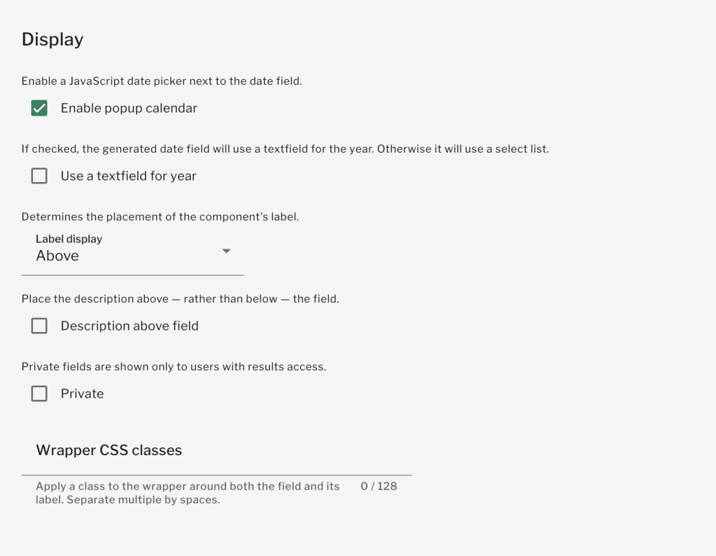
10. Enable popup calendar: Specify whether or not to provide the end user with a popup calendar to select their desired date.
11. Use a text field for year: Enable this checkbox to force end users to enter the year within a textfield.
12. Label display: Specify where the fields label should display out of the following options:
- Above
- Inline
- None
13. Description above field: Specify whether or not your description text appears above the field or below. Tick the box for it to appear above.
14. Private: Ticking this box will only show this field to users with results access such as a Publisher.
15. Wrapper CSS Classes: Please ignore this field as it is not something you can affect. We are working on removing it.
16. Save component: Click save when you are happy with your configuration.
Adding and editing an email component
To add an email component:
1. Enter the name of your Email component in the ‘Label’ field
2. Select ‘Email’ in the ‘Type’ dropdown
3. Specify whether or not this component should be mandatory using the checkbox
4. Click ‘Add’
The Email component consists of the following configuration fields:
1. Label: This is the exact same label you already entered from the component table
2. Form key: This is the exact same form key which is described above in the components table
3. User email as default: Tick this checkbox to populate this component with the logged-in users’ email address
4. Default value: Use this field to specify a default value for the webform component. The default value will be displayed when the user first opens the form.
5. Description: If needed, add a description for the component to help guide your respondent.

6. Multiple: Tick this box to allow multiple email addresses to be entered, separated by a comma
7. Format: Select one of the following options:
- Allow long format
- Short format only
8. Required: This is the exact same required checkboxes that is part of the component table. Specify whether or not this field is required.
9. Unique: Specify whether or not this component should be unique, meaning that two users cannot submit a form with the same email address.
10. Placeholder: Enter text here if you want some placeholder text to be displayed to the end-user until they start typing. For example: ‘example@invotra.com’.

11. Label display: Specify where the fields label should display out of the following options:
- Above
- Inline
- None
12. Description above field: Specify whether or not your description text appears above the field or below. Tick the box for it to appear above.
13. Disabled: Tick this box if you want the field to be disabled from editing but still shown to the end-user.
14. Private: Ticking this box will only show this field to users with results access such as a Publisher.
15. Wrapper CSS Classes: Please ignore this field as it is not something you can affect. We are working on removing it.
16. CSS Classes: Please ignore this field as it is not something you can affect. We are working on removing it.
17. Save component: Click save when you are happy with your configuration.
Adding and editing a Fieldset component
To add a fieldset component
1. Enter the name of your Fieldset component in the ‘Label’ field
2. Select ‘Fieldset’ in the ‘Type’ dropdown
3. Specify whether or not this component should be mandatory using the checkbox
4. Click ‘Add’
The Fieldset component consists of the following configuration fields:
1. Label: This is the exact same label you already entered from the component table
2. Form key: This is the exact same form key which is described above in the components table
3. Description: If needed, add a description for the component to help guide your respondent.
4. Collapsible: Tick this box to allow users to collapse and open the Fieldset.
5. Collapsed by default: Tick this box to make the Fieldset collapsed by default, meaning that the user will need to open the Fieldset in order to populate the fields within.
6. Hide label: Tick this box to hide the Fieldset label.
7. Description above field: Specify whether or not your description text appears above the field or below. Tick the box for it to appear above.
8. Private: Ticking this box will only show this field to users with results access such as a Publisher.
9. CSS Classes: Please ignore this field as it is not something you can affect. We are working on removing it.
10. Save component: Click save when you are happy with your configuration.

11. Add components to your Fieldset: Use the drag & drop function within the components table to drag your components underneath the Fieldset.
12. Save: Save the ordering of your components within the Fieldset.
Adding and editing a File component
To add a file component:
1. Enter the name of your File component in the ‘Label’ field
2. Select ‘File’ in the ‘Type’ dropdown
3. Specify whether or not this component should be mandatory using the checkbox
4. Click ‘Add’
The File component consists of the following configuration fields:
1. Label: This is the exact same label you already entered from the component table
2. Form key: This is the exact same form key which is described above in the components table
3. Description: If needed, add a description for the component to help guide your respondent.
4. Upload destination: Specify whether the file should be uploaded into the public or private files directory. We recommend using the default ‘Private’ as selecting public will make the file available to unauthenticated users.
5. Upload directory: Specify a subdirectory for the files to be uploaded to if you want to. This will have no real effect for you or your users.
6. Rename files: If required, you can automatically change the file name of the files using this field.
7. Required: This is the exact same required checkboxes that is part of the component table. Specify whether or not this field is required.

8. Max upload size: Specify the maximum upload size for the files. You are limited to the maximum configured on the Invotra servers.
9. Allowed file extensions: Use the tick boxes to select the file types you want to be uploaded.

10. Label display: Specify where the fields label should display out of the following options:
- Above
- Inline
- None
11. Description above field: Specify whether or not your description text appears above the field or below. Tick the box for it to appear above.
12. Private: Ticking this box will only show this field to users with results access such as a Publisher.
13. Wrapper CSS Classes: Please ignore this field as it is not something you can affect. We are working on removing it.
14. CSS Classes: Please ignore this field as it is not something you can affect. We are working on removing it.
15. Save component: Click save when you are happy with your configuration.
Adding and editing a Grid component
To add a grid component:
1. Enter the name of your Grid component in the ‘Label’ field
2. Select ‘Grid’ in the ‘Type’ dropdown
3. Specify whether or not this component should be mandatory using the checkbox
4. Click ‘Add’
The File component consists of the following configuration fields:
1. Label: This is the exact same label you already entered from the component table
2. Form key: This is the exact same form key which is described above in the components table
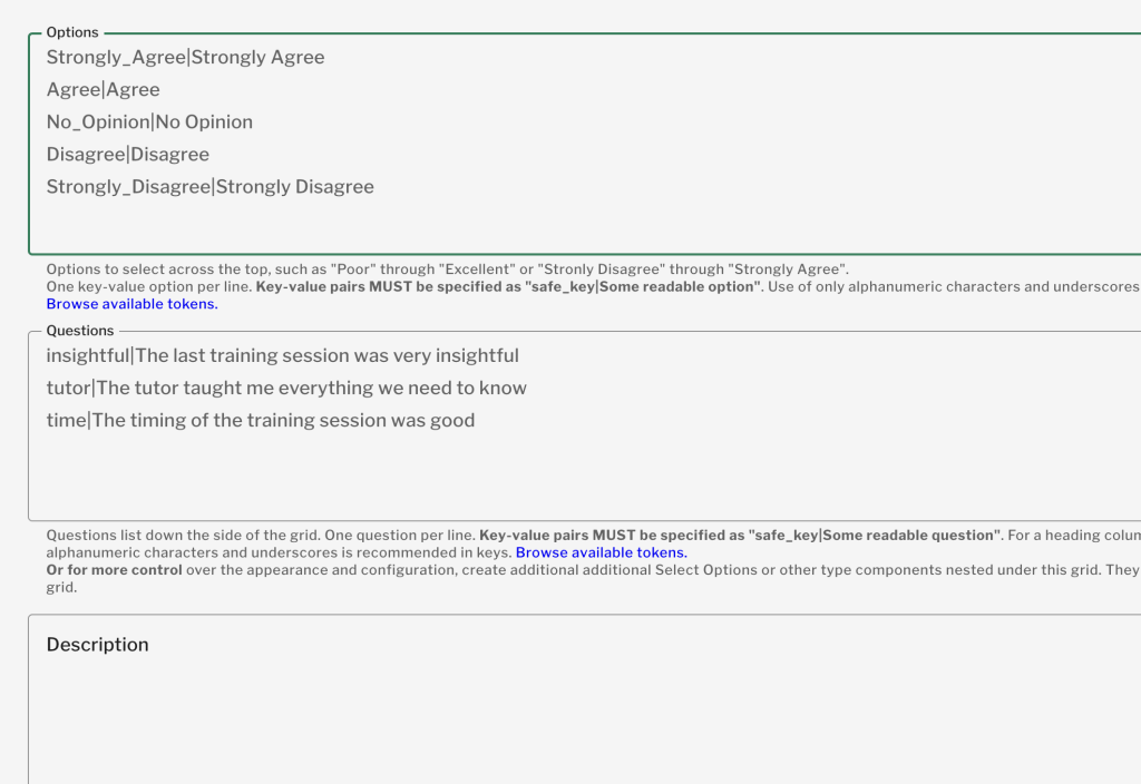
3. Options: The options will appear across the top of the grid. You must add each option on a new line in the following format:
- The safe_key must be unique, lower case and contain no spaces. Underscores are recommended instead of spaces.
- The Readable label will be what the end user selects
- safe_key|Readable label
4. Questions: These options will appear down the side of the grid. You must add each question on a new line in the following format:
- The safe_key must be unique, lower case and contain no spaces. Underscores are recommended instead of spaces.
- The Readable label will be what the end user selects
- safe_key|Readable label
5. Description: If needed, add a description for the component to help guide your respondent.
6. Default value: If needed, specify a default option for each question using the safe_key value.
7. Required: This is the exact same required checkboxes that is part of the component table. Specify whether or not this field is required.
8. Unique: Specify whether or not this component should be unique, meaning that the same value is not allowed to be used twice.
9. Randomize Options: Check this box to randomise the order of the options along the top of the grid each time the form is loaded.
10. Randomize Questions: Check this box to randomise the order of the questions along the left hand side of the grid each time the form is loaded.
11. Sticky table header: Check this box to ensure that the options are always visible even when the user scrolls.
12. Hide label: Tick this box to hide the Grid label.
13. Description above field: Specify whether or not your description text appears above the field or below. Tick the box for it to appear above.
14. Private: Ticking this box will only show this field to users with results access such as a Publisher.
15. Wrapper CSS Classes: Please ignore this field as it is not something you can affect. We are working on removing it.
16. Save component: Click save when you are happy with your configuration.#

Adding and editing a Hidden component
To add a hidden component:
1. Enter the name of your Hidden component in the ‘Label’ field. As this is a hidden component, this will never be seen by the end-user.
2. Select ‘Hidden’ in the ‘Type’ dropdown
3. Specify whether or not this component should be mandatory using the checkbox
4. Click ‘Add’
The Hidden component consists of the following configuration fields:
1. Label: This is the exact same label you already entered from the component table
2. Form key: This is the exact same form key which is described above in the components table
3. Default value: Specify the value of the hidden form component. This can be used to capture information about the user without them knowing.
4. Hidden type: Specify whether or not the hidden component should be a secure value or a hidden element on the form. We recommend using a secure value if you want to ensure that this cannot be seen or changed by the end user.
5. Save component: Click save when you are happy with your configuration.

Adding and editing a Markup component
To add a markup component:
1. Enter the name of your Markup component in the ‘Label’ field.
2. Select ‘Markup’ in the ‘Type’ dropdown
3. Specify whether or not this component should be mandatory using the checkbox
4. Click ‘Add’
The Markup component consists of the following configuration fields:
1. Label: This is the exact same label you already entered from the component table
2. Form key: This is the exact same form key that is described above in the components table
3. Value: Use the WYSIWYG editor to enter your HTML markup. You can use this to provide guidance or relevant information to the end-user.
4. Display on: Use the options in the dropdown to specify where the HTML should display from the following:
- Form only
- Viewed submission only
- Both form and viewed submission
5. Save component: Click save when you are happy with your configuration.

Adding and editing a Number component
To add a number component:
1. Enter the name of your Number component in the ‘Label’ field.
2. Select ‘Number’ in the ‘Type’ dropdown
3. Specify whether or not this component should be mandatory using the checkbox
4. Click ‘Add’
The Number component consists of the following configuration fields:
1. Label: This is the exact same label you already entered from the component table
2. Form key: This is the exact same form key which is described above in the components table
3. Default value: Use this field to specify a default value for the webform component. The default value will be displayed when the user first opens the form.
4. Description: If needed, add a description for the component to help guide your respondent.
5. Required: Tick this box to make the webform component a required field. The user must then populate this field before they can submit the form.
6. Unique: Specify whether or not this component should be unique, meaning that two users cannot submit a form with the same number value.
7. Integer: Tick this box to ensure that the user enters a whole number. Decimal places will not be allowed.
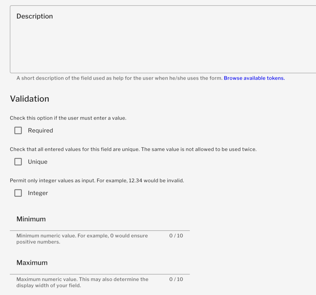
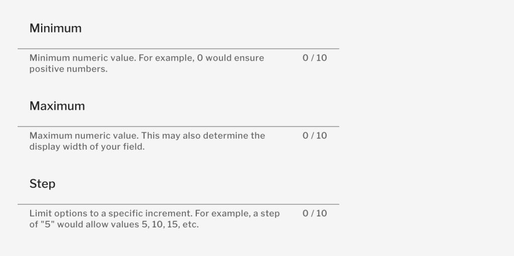
8. Minimum: Enter the minimum number that can be added. Entering 0 would force the user to enter positive numbers. Leave empty for no minimum.
9. Maximum: Enter the maximum value that may be entered by the user. Leave empty for no maximum.
10. Step: Enter a step increment value. For example, entering ‘5’ will only allow multiples of 5.
11. Element type: Specify whether you want the user to enter an amount or select from a dropdown.
12. Placeholder: Enter text here if you want some placeholder text to be displayed to the end-user until they start typing.
13. Prefix text: Enter any text you want to be placed to the left-hand side of the field. For example currency characters such as £ or $.
14. Postfix text: Enter any text you want to be placed to the right-hand side of the field. For example %, lb or kg.

15. Decimal places: Use the dropdown to select how many decimal places are allowed, if any. Automatic will display up to 4 decimal places if relevant.
16. Thousands separator: Use the dropdown to specify whether or not you want thousands to be separated and if so, using which character.
17. Decimal point: Specify the character that should be used for a decimal point.
18. Label display: Specify where the fields label should display out of the following options:
- Above
- Inline
- None
19. Description above field: Specify whether or not your description text appears above the field or below. Tick the box for it to appear above.
20. Disabled: Tick this box to make the field non-editable to end-users.
21. Private: Ticking this box will only show this field to users with results access such as a Publisher.
22. Wrapper CSS Classes: Please ignore this field as it is not something you can affect. We are working on removing it.
23. CSS Classes: Please ignore this field as it is not something you can affect. We are working on removing it.
24. Exclude zero: Tick this box to exclude entries of zero (or blank) when counting submissions to calculate the average and standard deviation.
25. Save component: Click save when you are happy with your configuration.
Adding and editing a Page Break component
To add a page break component:
1. Enter the name of your Page Break component in the ‘Label’ field.
2. Select ‘Page Break’ in the ‘Type’ dropdown
3. Specify whether or not this component should be mandatory using the checkbox
4. Click ‘Add’
The Page Break component consists of the following configuration fields:
1. Label: This is the exact same label you already entered from the component table
2. Form key: This is the exact same form key which is described above in the components table
3. Next page button label: Specify the name of the button displayed to the user in order to go to the next page.
4. Previous page button label: Specify the name of the button displayed to the user in order to go to the previous page.

Adding and editing a Select Options component
To add a select options component:
1. Enter the name of your Select Options component in the ‘Label’ field.
2. Select ‘Select Options’ in the ‘Type’ dropdown
3. Specify whether or not this component should be mandatory using the checkbox
4. Click ‘Add’
The Select Options component consists of the following configuration fields:
1. Label: This is the exact same label you already entered from the component table
2. Form key: This is the exact same form key which is described above in the components table
3. Default value: Use this field to specify a default value for the webform component. The default value will be displayed when the user first opens the form. Use the safe_key to add the default and separate by a comma for multiple.
4. Description: If needed, add a description for the component to help guide your respondent.
5. Options: Enter the options for the user to choose from. You must add each option on a new line in the following format:
- The safe_key must be unique, lower case and contain no spaces. Underscores are recommended instead of spaces.
- The Readable label will be what the end-user selects
- safe_key|Readable label
6. Multiple: Tick this box to allow the user to select multiple options.
7. Load a pre-built option list: Use this handy dropdown if you want the user to select:
- Days of the week
- Countries
- US States
8. Required: Tick this box to make the webform component a required field. The user must then populate this field before they can submit the form.

9. Listbox: Select this checkbox if you want the options to be displayed in a Listbox rather than as radio buttons or checkboxes.
10. Randomize options: Tick this box if you want the options to display in a random order every time the form loads.
11. Label display: Specify where the fields label should display out of the following options:
- Above
- Inline
- None

12. Description above field: Specify whether or not your description text appears above the field or below. Tick the box for it to appear above.
13. Private: Ticking this box will only show this field to users with results access such as a Publisher.
14. Wrapper CSS Classes: Please ignore this field as it is not something you can affect. We are working on removing it.
15. CSS Classes: Please ignore this field as it is not something you can affect. We are working on removing it.
16. Save component: Click save when you are happy with your configuration.
Adding and editing a Text Area component
To add a text area component:
1. Enter the name of your Text Area component in the ‘Label’ field.
2. Select ‘Text Area’ in the ‘Type’ dropdown
3. Specify whether or not this component should be mandatory using the checkbox
4. Click ‘Add’
The Text Area component consists of the following configuration fields:
1. Label: This is the exact same label you already entered from the component table
2. Form key: This is the exact same form key which is described above in the components table
3. Default value: Use this field to specify a default value for the webform component. The default value will be displayed when the user first opens the form.
4. Description: If needed, add a description for the component to help guide your respondent.
5. Required: Tick this box to make the webform component a required field. The user must then populate this field before they can submit the form.
6. Height: Display the number of rows you want to display for the text area. Leave blank for the default size. We recommend using the default and then increase.decrease if necessary.
7. Placeholder: Enter text here if you want some placeholder text to be displayed to the end user until they start typing.
8. Label display: Specify where the fields label should display out of the following options:
- Above
- Inline
- None

9. Description above field: Specify whether or not your description text appears above the field or below. Tick the box for it to appear above.
10. Disabled: Tick this box if you want the field to be disabled from editing but still shown to the end user.
11. Private: Ticking this box will only show this field to users with results access such as a Publisher.
12. Wrapper CSS Classes: Please ignore this field as it is not something you can affect. We are working on removing it.
13. CSS Classes: Please ignore this field as it is not something you can affect. We are working on removing it.
14. Save component: Click save when you are happy with your configuration.
Adding and editing a Text Field component
To add a text field component:
1. Enter the name of your Text Field component in the ‘Label’ field.
2. Select ‘Text Field’ in the ‘Type’ dropdown
3. Specify whether or not this component should be mandatory using the checkbox
4. Click ‘Add’
The Text Field component consists of the following configuration fields:
1. Label: This is the exact same label you already entered from the component table
2. Form key: This is the exact same form key which is described above in the components table
3. Default value: Use this field to specify a default value for the webform component. The default value will be displayed when the user first opens the form.
4. Description: If needed, add a description for the component to help guide your respondent.
5. Required: Tick this box to make the webform component a required field. The user must then populate this field before they can submit the form.
6. Unique: Specify whether or not this component should be unique, meaning that two users cannot submit a form with the same email address.
7. Maxlength: Specify the maximum character length allowed within the field.
8. Minlength: Specify the minimum character length allowed within the field.
9. Placeholder: Enter text here if you want some placeholder text to be displayed to the end user until they start typing.
10. Prefix text: Enter any text you want to be placed to the left hand side of the field. For example currency characters such as £ or $.
11. Postfix text: Enter any text you want to be placed to the right hand side of the field. For example %, lb or kg.
12. Label display: Specify where the fields label should display out of the following options:
- Above
- Inline
- None
13.Description above field: Specify whether or not your description text appears above the field or below. Tick the box for it to appear above.
14. Disabled: Tick this box if you want the field to be disabled from editing but still shown to the end user.
15. Private: Ticking this box will only show this field to users with results access such as a Publisher.
16. Wrapper CSS Classes: Please ignore this field as it is not something you can affect. We are working on removing it.
17. CSS Classes: Please ignore this field as it is not something you can affect. We are working on removing it.
18. Save component: Click save when you are happy with your configuration.
Adding and editing a Time component
To add a Time component:
1. Enter the name of your Time component in the ‘Label’ field.
2. Select ‘Time’ in the ‘Type’ dropdown
3. Specify whether or not this component should be mandatory using the checkbox
4. Click ‘Add’
The Time component consists of the following configuration fields:
1. Label: This is the exact same label you already entered from the component table
2. Form key: This is the exact same form key which is described above in the components table
3. Default value: Use this field to specify a default value for the webform component. The default value will be displayed when the user first opens the form.
4. Description: If needed, add a description for the component to help guide your respondent.
5. Default value timezone: Specify whether to use the Users timezone or the Timezone of the intranet itself. For most of our customers, this will be the same timezone so the default is just fine.
6. Required: Tick this box to make the webform component a required field. The user must then populate this field before they can submit the form.
7. Start time: Enter the earliest time that can be added by the end user.
8. End time: Enter the latest time that can be added by the end user.

9. Time format: Select whether or not the format should be a 12-hour or 24-hour clock.
10. Minute increments: Specify the minute increments that the user can add from the following options:
- 1 minute
- 5 minute
- 10 minute
- 15 minute
- 30 minute

11. Label display: Specify where the fields label should display out of the following options:
- Above
- Inline
- None
12. Description above field: Specify whether or not your description text appears above the field or below. Tick the box for it to appear above.
13. Private: Ticking this box will only show this field to users with results access such as a Publisher.
14. Wrapper CSS Classes: Please ignore this field as it is not something you can affect. We are working on removing it.
15. Save component: Click save when you are happy with your configuration.

Configuring conditional components
Once you have created your webform and added components, you may configure conditional components. Conditional components allow you to show/hide or set default values for components based on selections that the user has made.
For example, if you only want to display a text field if the user selects ‘Other’ then you can do this using webform conditionals.
1. Firstly, click on the ‘Conditionals’ link in the webform menu

2. Click on the ‘+’ button to add a new condition

3. Use the conditionals form to add/edit/remove your conditional options. The form will automatically pull through components you have added in your webform. In my example below, I am displaying the ‘Other’ field and making it required if the user selects ‘Other’ within my dropdown component.

Configuring emails
You can configure emails to be automatically sent each time a webform is submitted.
1. Firstly, click on the ‘Emails’ link in the webform menu

2. Select ‘Address’ if you want to send an email to a specific email address

3. Select ‘Component value’ if you want to send an email to an email address submitted within the form itself, such as the users email address. This will automatically allow you to select eligible components in the dropdown
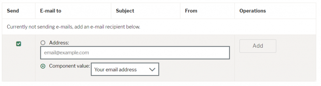
4. Click ‘Add’
5. Email to address: This is the same field you just configured above. It specifies the email address that will be sent the email.
6. Enable sending: Tick this box to enable the email. Unticking the box will disable it from sending.

7. Email subject: Specify the subject of the email from the following options:
- Default: This will set the email subject to the name of the webform
- Custom: This allows you to define the email subject yourself using the box provided
- Component: Set the email subject to be the value of one of the webforms components
8. Email from address: Specify the from address of the email that is sent out using the following options:
- Default: This will set the from address to ‘do-not-reply’ @ the email address configured on your intranet
- Custom: This allows you to define the from address yourself using the box provided
- Component: Set the from address to be the value of one of the webforms components

9. Email from name: Specify the name which the email address is coming from using the following options:
- Default: This will set the name to the name of your intranet
- Custom: This allows you to define the name yourself using the text box provided
- Component: Set the name to the value of one of the webforms components
10. Email template: Select an email template. We recommend using the default template as it’s not possible to configure a custom one.

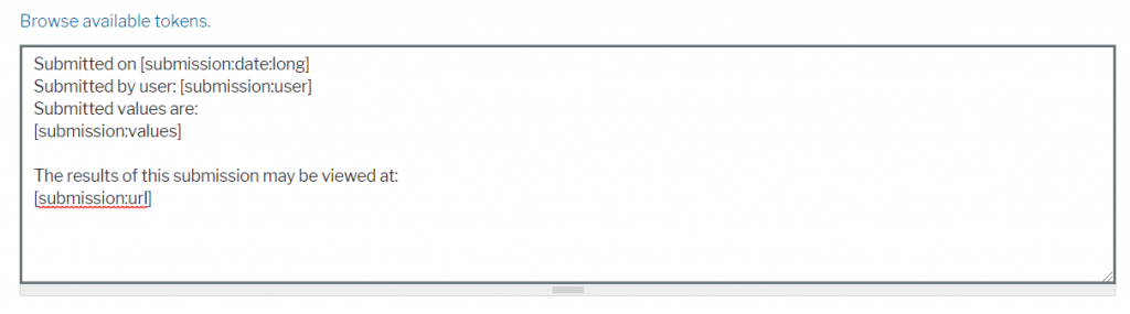
11. Add the contents of your email using the text box provided. You can use tokens to display the values of the submitted webform if needed.
12. Include submission as a CSV attachment: Tick this box to attach a csv to the email containing the results of the submitted form.
13. Included email values: Tick the components you want to be displayed in the csv attachment.

14. Save the form
Configuring from settings
There are many additional form settings to make your webform exactly as you need it.
1. Firstly, click on the ‘Form Settings’ link in the webform menu

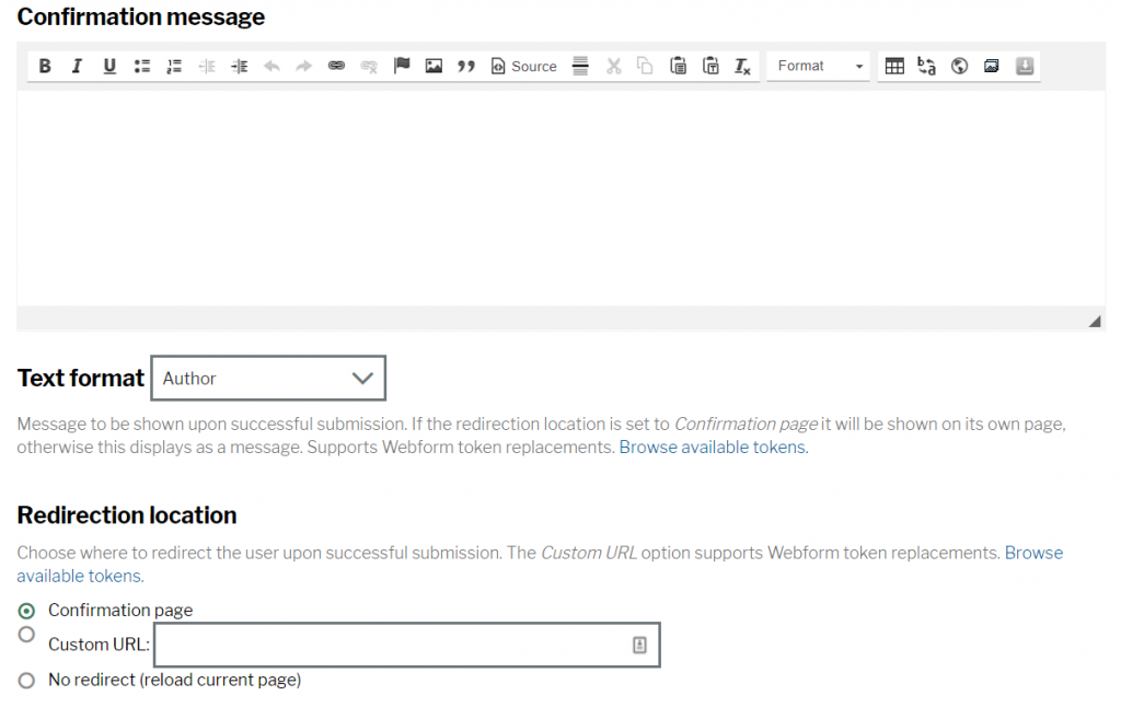
2. Confirmation message: Use the text area provided to configure the confirmation message displayed to the end user once they have submitted the form provided that you have selected ‘Confirmation page’ as the ‘Redirection location’
3. Redirection location: Specify where the user should be redirected to when they have submitted their form from the following options:
- Confirmation page: Leads to a static page displaying the message you configure in step 2 above
- Custom URL: Send the user to a URL of your choosing using the text box provided
- No redirect
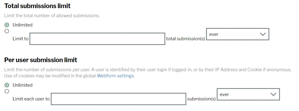
4. Total submissions limit: Select ‘Unlimited’ to allow unlimited submissions or alternatively you can set a limit using the options provided.
5. Per-user submission limit: Select ‘Unlimited’ to allow users to submit the form as many times as they want or alternatively you can set a limit per user using the options provided.
6. Status of this form: Selecting ‘Open’ will mean that the form is still open for submission. Selecting ‘Closed’ will stop users from being able to submit the form.

7. Roles that can submit this webform: Tick the Invotra roles who you want to be able to submit the webform.
8. Progress bar: Use the options provided to configure your progress bar on the webform. This is mostly used when you have a large, multi-step webform.

9. Enable preview page: Tick this box to allow users to preview their form submission before submitting it.

10. Advanced settings: Use the advanced settings to configure:
- Show saved draft button: Allow users to save their submission progress as a draft and come back to it later
- Automatically save as draft: Automatically save the submission as a draft when the end user navigates through multiple pages
- Show the notification about previous submissions: Users will see a notice message if they have previously submitted the form
- Confidential submissions: Ticking this box will not record the users’ IP address for this webform
- Submit button label: Change the text of the submit button for the webform
- Next submission number: By default the submissions start with an ID of 1 and increment from there. You can change this if needed.
0 Comments